Quick Start Guide
Get started with Easy Email Pro in minutes. This guide will walk you through the basic setup and implementation of the email editor.
Option 1: Use Demo Templates
The quickest way to get started is to use our pre-built demo templates. Browse our collection of starter templates at our GitHub repositories.
Option 2: Manual Setup
If you prefer to set up from scratch, install the required packages:
Step 1: Install Dependencies
pnpm install easy-email-pro-core easy-email-pro-editor easy-email-pro-theme easy-email-pro-kit @arco-design/web-react @arco-themes/react-easy-email-pro mjml-browser slate slate-react slate-history
Or with npm/yarn:
npm install easy-email-pro-core easy-email-pro-editor easy-email-pro-theme easy-email-pro-kit @arco-design/web-react @arco-themes/react-easy-email-pro mjml-browser slate slate-react slate-history
Follow these steps to create your first email editor:
Step 2: Create Your Editor Component
First, install all required packages using your preferred package manager:
import React, { useMemo, useRef } from "react";
import { EmailEditorProvider, EmailTemplate } from "easy-email-pro-editor";
import {
  EditorContextProps,
  Retro,
  ThemeConfigProps,
} from "easy-email-pro-theme";
import "easy-email-pro-theme/lib/style.css";
import mjml from "mjml-browser";
// Theme style, If you need to change the theme, you can make a duplicate in https://arco.design/themes/design/6979/setting/base/Color
import "@arco-themes/react-easy-email-pro/css/arco.css";
import templateData from "./template.json";
import { EditorCore } from "easy-email-pro-core";
import axios from "axios";

export default function MyEditor() {
  const instanceRef = useRef<EditorContextProps | null>(null);

  // Initialize editor with template data
  // You can fetch this data from your server or use a local JSON file
  const initialValues: EmailTemplate = useMemo(() => {
    return {
      subject: templateData.subject,
      content: templateData.content,
    };
  }, []);

  // Handle file uploads (images, etc.)
  // Replace this with your actual upload implementation
  const onUpload = async (file: Blob): Promise<string> => {
    // Example: Upload to your server or CDN
    // const formData = new FormData();
    // formData.append("file", file);
    // const response = await fetch("/api/upload", {
    //   method: "POST",
    //   body: formData,
    // });
    // const { url } = await response.json();
    // return url;

    // For demo purposes, return a placeholder URL
    return Promise.resolve(
      "https://res.cloudinary.com/dfite2e16/image/upload/v1681907056/clgnivsuj0018z9ltiixmxf6k/ilh6rri61f512i7wb6yd.png"
    );
  };

  // Handle form submission
  // This is called when the user clicks the save/submit button
  const onSubmit: ThemeConfigProps["onSubmit"] = async (values, editor) => {
    console.log("Template values:", values);
    console.log("Editor instance:", editor);

    // Convert the template to MJML format
    const mjmlStr = EditorCore.toMJML({
      element: values.content,
      mode: "production",
      beautify: true,
    });

    // Convert MJML to HTML using mjml-browser
    const html = mjml(mjmlStr).html;

    // Send to your backend API
    await axios.post("/your-server-url", {
      content: values.content,
      subject: values.subject,
      html: html,
    });
  };

  // Handle real-time changes
  // This is called whenever the template is modified
  const onChange: ThemeConfigProps["onChange"] = async (values, editor) => {
    console.log("Template changed:", values);
    // Optional: Auto-save, validation, etc.
  };

  // Configure the editor with all necessary options
  const config = Retro.useCreateConfig({
    // Client ID for paid plans (optional for free tier)
    // After subscribing to a paid plan, you'll receive a client ID from support
    clientId: process.env.CLIENT_ID,

    // Reference to access editor instance programmatically
    instanceRef: instanceRef,

    // Editor height
    height: "calc(100vh - 66px)",

    // Required handlers
    onUpload,
    initialValues: initialValues,
    onSubmit: onSubmit,
    onChange: onChange,

    // UI Features
    showSourceCode: true,        // Show JSON source code panel
    showLayer: true,             // Show layer tree in sidebar
    showPreview: true,           // Show email preview
    showSidebar: true,           // Show left sidebar with blocks
    showBlockPaths: true,        // Show breadcrumb path for selected block
    compact: false,              // Single or double sidebar layout
    showDragMoveIcon: true,      // Show drag handle icons
    showInsertTips: true,        // Show insertion hints

    // Feature Flags
    enabledAutoComplete: true,   // Enable automatic container structure completion
  });

  return (
    <EmailEditorProvider {...config}>
      <Retro.Layout></Retro.Layout>
    </EmailEditorProvider>
  );
}
template.json
{
  "subject": "Welcome to Easy Email Pro",
  "content": {
    "data": {
      "breakpoint": "480px",
      "globalAttributes": {
        "font-family": "Arial, sans-serif"
      }
    },
    "type": "page",
    "children": [
      {
        "type": "standard-section",
        "data": {},
        "attributes": {},
        "children": [
          {
            "type": "standard-column",
            "data": {},
            "attributes": {},
            "children": [
              {
                "type": "placeholder",
                "data": {},
                "attributes": {},
                "children": [
                  {
                    "text": ""
                  }
                ]
              }
            ]
          }
        ]
      }
    ],
    "attributes": {
      "background-color": "#f5f5f5",
      "content-background-color": "#ffffff"
    }
  }
}
Step 3: Template Structure
The template follows a hierarchical structure. Here's a minimal template structure:
template.json
{
  "subject": "Welcome to Easy Email Pro",
  "content": {
    "data": {
      "breakpoint": "480px",
      "globalAttributes": {
        "font-family": "Arial, sans-serif"
      }
    },
    "type": "page",
    "children": [
      {
        "type": "standard-section",
        "data": {},
        "attributes": {},
        "children": [
          {
            "type": "standard-column",
            "data": {},
            "attributes": {},
            "children": [
              {
                "type": "placeholder",
                "data": {},
                "attributes": {},
                "children": [{ "text": "" }]
              }
            ]
          }
        ]
      }
    ],
    "attributes": {
      "background-color": "#f5f5f5",
      "content-background-color": "#ffffff"
    }
  }
}
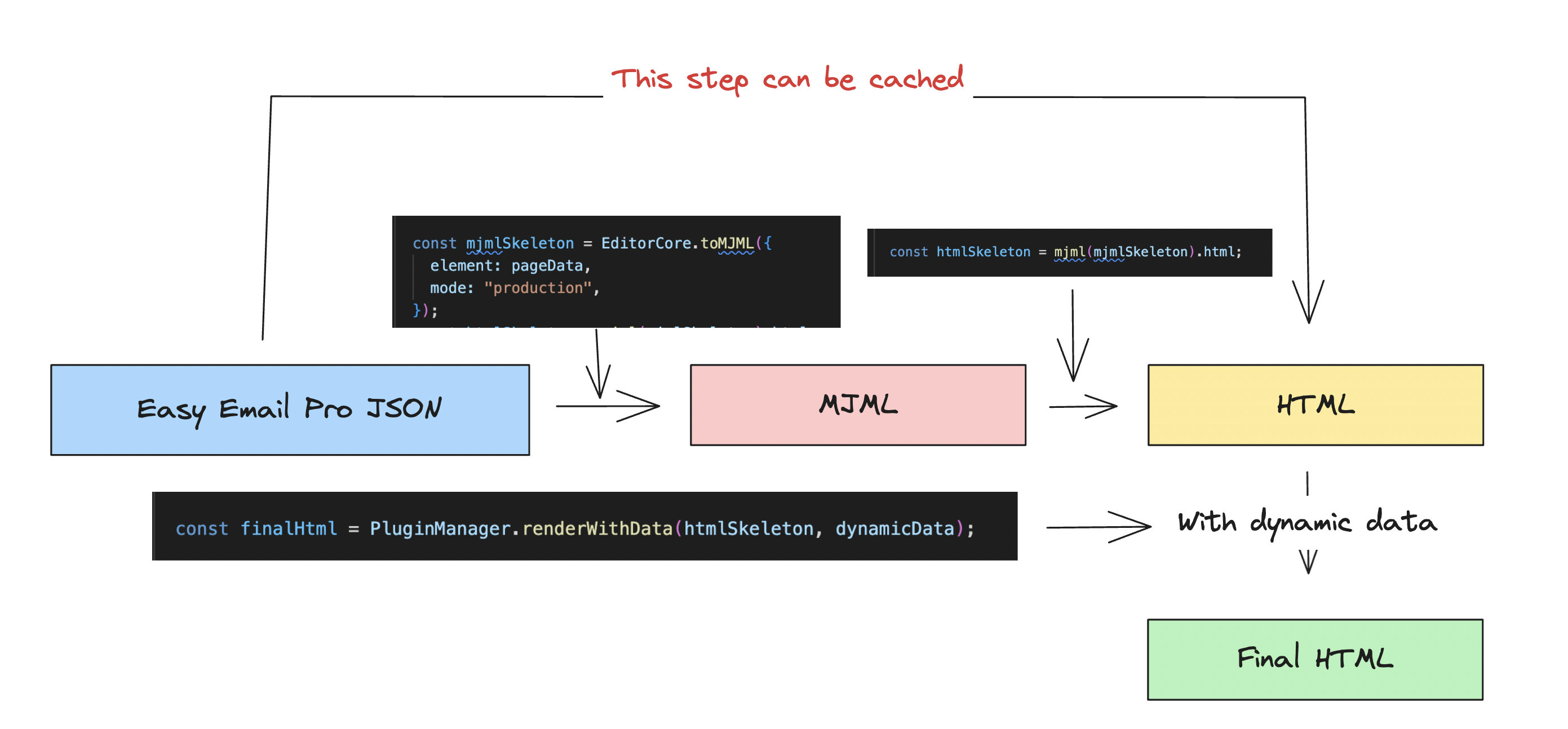
How It Works
Easy Email Pro uses a two-stage rendering process:
- Edit Mode: Uses React components for interactive editing
- Production Mode: Converts to MJML, then to HTML for email clients
Next Steps
Now that you have a basic editor set up, explore these resources:
- Live Demo: Try the full-featured editor at https://demo.easyemail.pro
- Demo Code: Check out complete examples at https://github.com/easy-Email-Pro/
- Configuration: Learn about all configuration options in the Configuration Guide
- Examples: Browse practical examples in the Examples Section
- API Reference: Dive into the API Documentation
Common Next Steps
- Customize Block Categories: Configure which blocks appear in the sidebar
- Add Custom Blocks: Create your own reusable components
- Integrate with Backend: Connect file uploads and template saving to your API
- Customize Theme: Match the editor's appearance to your brand
- Add Localization: Support multiple languages